Since this iframe isn't working...

Click here to open menu page!

digital home of isocosa promo flyer
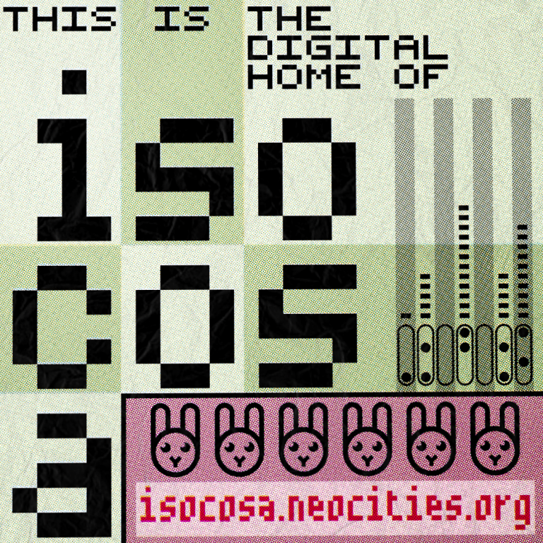
Title:digital home of isocosa promo flyer
Date:2019-10-25
Medium:Vector Art, Raster Art
Tools:Inkscape, paint.net

This is promotional artwork that I made for my website. I've stylized it to look like a weird and kinda eccentric minimalistic flyer for some weird EDM/techno event. I'm quite satisfied with it! The colors used are indeed the same as the colors used on this website. Having it any other way wouldn't make much sense, and hey, it is a nice color scheme (pink and green are my favorite colors hehe)!
I've tried my best to make it look like it was a scan of a print that was slightly worn. I think I did a good job in that regard!
This image is used on the About Me page, along with a cropped version being the banner artwork that I use on various social media sites I use.
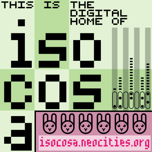
As a bonus, here's the clean version without any post-processing applied. I'll be honest, I don't think it looks as good without the post processing, but still, it's quite interesting!