Since this iframe isn't working...

Click here to open menu page!

Lucy and the Gem Dungeon: Game Artwork

Warning: This page contains spoilers for Lucy and the Gem Dungeon.
Title:Lucy and the Gem Dungeon: Game Artwork
Date:2021-09-24
Medium:Pixel Art
Tools:paint.net

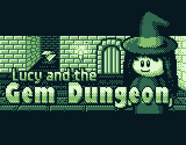
This page is a collection of artwork I made for my GBJAM 9 game Lucy and the Gem Dungeon. I've decided to go with the title screen as the image representing the whole collection.
The title screen was the artwork I spent the most time on, obviously. It includes Lucy, who's the main character of the game, along with a gem, which is the game's objective and the titular dungeon. Basically, it represent the game and its goal.
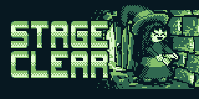
The artwork used for the STAGE CLEAR screen, featuring Lucy happily coming through the exit with a diamond!
The background in this one is a rather rough sketch, as I planned to redo it properly later, but didn't get around to it since well... I didn't want to run out of time with the game jam!
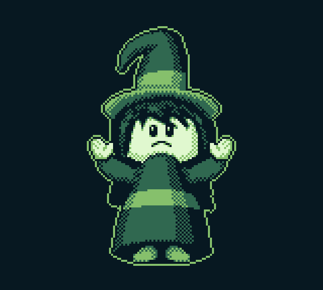
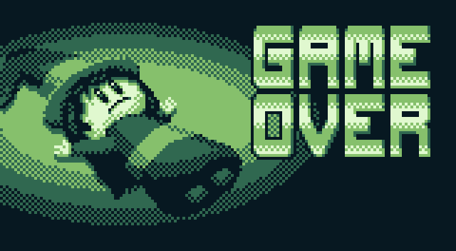
The artwork for the simple animation that plays after getting a game over. In the game, this picture of Lucy drops down beyond the screen, after which she exclaims "Game Over!".

This artwork is used for the Game Over screen which shows up after the aforementioned animation. Rather simple but works very well in my opinion.

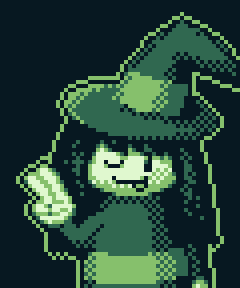
A cute little drawing of Lucy that appears in the credits. I wanted to give a little reward to anyone who was willing to look at the credits, so I though having a small bonus drawing would be nice!

Ending Sequence

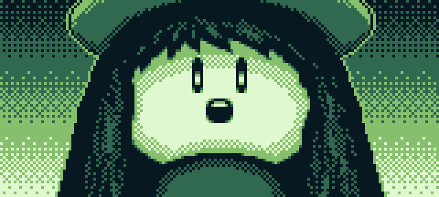
A closeup of Lucy's face with light shining from below. I think it turned out pretty nice, even if it is rather simple!

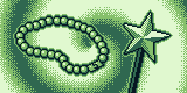
Lucy's items. I wanted to make it a look nicer, with her wand glowing and hovering over the palm of her hand, but I couldn't get the hand to look right, so I gave up and settled with this rather simple artwork.

Lucy embarking on a new journey! The background in this image is actually a stock image I've taken from Pixabay. However, I don't remember which picture it was. Sorry!
I think it works well, though, even if converting images into "pixel art" is quite sacrilege.
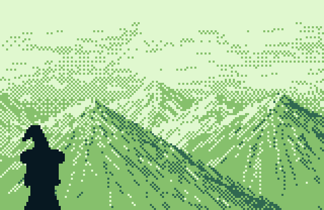
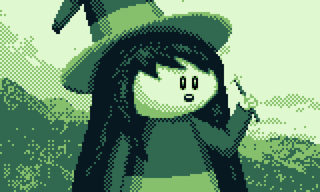
Lucy looking towards a mountainscape.
Originally, the mountainscape was yet another converted stock photo from Pixabay, but I was so unhappy with it that I decided to just draw a proper background for this one. I'm still not fully happy with it, but it's way better than what I had before.
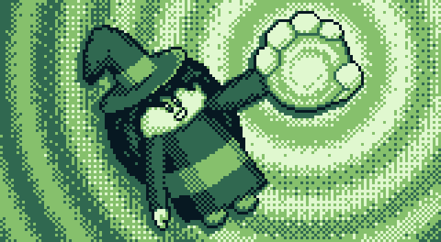
A bonus picture that shows up as a reward for beating the game with all bonus orbs collected. The image, obviously, depicts Lucy holding a bonus orb.
Yeah, I know, the picture is kinda wonky, I'm not the greatest artist and I had a time limit, so give me a break! :P

Workstages

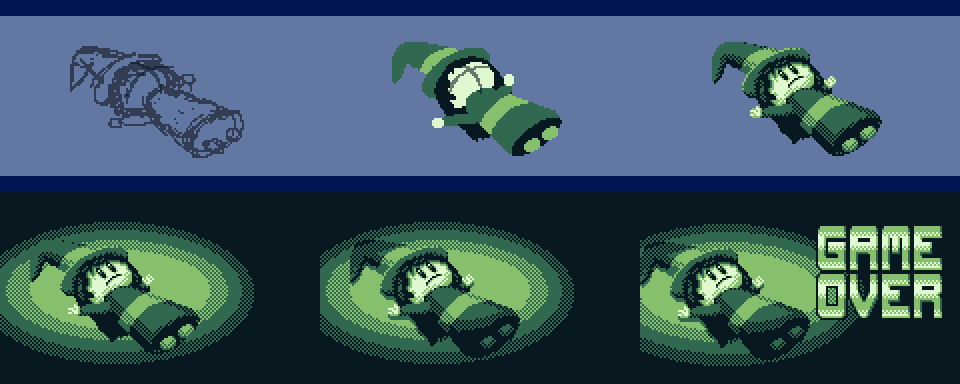
Workstages for the Game Over sequence artwork. As you can see, I started out with a simple sketch, then used the sketch as a base to make the basic shapes, then refined and shaded these shapes. It's a rather simple, but effective process.

The Game Over screen was done in pretty much the same way. I do think the spotlight effect turned out really nice, the difference between 4th and 5th step is rather subtle but adds a lot!

Stage Clear screen! I thought about redrawing the gem, but in the end just opted to use the gem sprite art instead because it was easier and it worked.

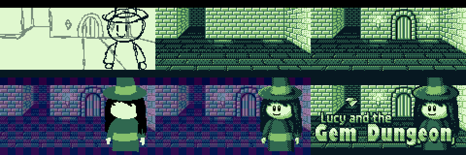
The title screen was the most difficult artwork to make. As you can see, the first thing was obviously the preliminary sketch, then making the background, and in the end drawing Lucy herself.
The gem is actually the last thing added to this picture, and it's just reusing the sprite from the game again. If it works, it works :P

For the first picture shown in the ending sequence, it appears I went straight to the basic shape phase, with only using a sketched guide to determine how to position Lucy's face.

Third picture of the ending sequence was done like this. Yeah, pretty much the same process as any other artwork I did for the game.

Workstages for the bonus ending artwork! Yeah, not much else to say here, honestly.