Space Banaan!

| Title: | Space Banaan! |
| Date: | 2023-12-25 |
| Medium: | Raster Art |
| Tools: | Affinity Photo |
This one took me a long time, since it's a lot less abstract, and also I'm more of a designer than an artist, so drawing more concrete things is something I'm not all that great at. Still, I think it's neat!
Workstages
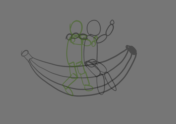
 Yeah, first of all, a rough sketch is in order. Simple blobs to roughly represent the pose.
The basic idea is there, but we're still a long way from what we want.
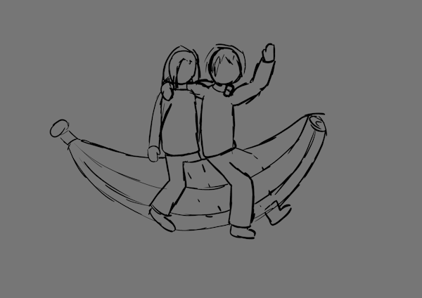
 A more refined sketch. Adding details such as hair and more refined shape edges.
The pose was adjusted a bit, since I realized the pose I wanted to go with originally would be too awkward for me to draw.
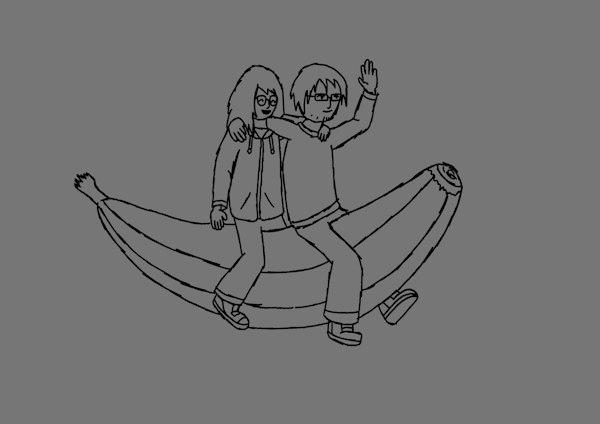
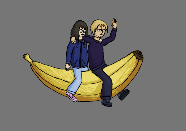
 Time for proper linework! We've got all the small details, the final pose and proper clothes!
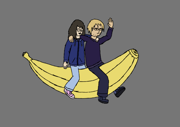
 Time to color it in! The colors of our clothes are based on what we were wearing at the time of drawing. No, he didn't see the drawing until Christmas, but I did look at him for reference :P
 Shading! Tried my best to represent the softness of materials with how I scribbled in the shading. For example, my boyfriend's really soft sweater (soft hugs! ^w^) is shaded in a more poofy manner than my hoodie, which is not as soft.
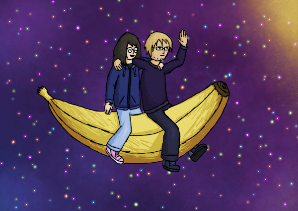
 Space time! Drawing the background wasn't too difficult. The stars did go through a bunch of tweaking before settling on the current look. I've experimented with having the stars have different glow effects, but ultimately I ended up with just using the simple glow effect for them.
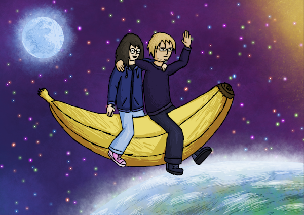
 What's space without planets and moons? Well, it's still space but not very exciting. So, I drew the Earth and the Moon! A bit messy, as most of the effort was spent on the Moon. If you stare at the Moon, you'll figure out why :P
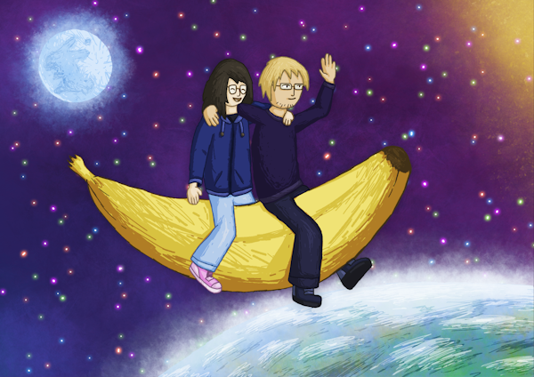
 The finished version! I wasn't happy with the thick black outlines because they didn't match the background, so I've ended up replacing them thinner colored outlines. In order to emphasize the contrast between the background and the main part of the picture, I added a subtle drop shadow effect. Admittedly, the outlines could've been a bit darker. Also, I've tweaked the colors of the whole drawing a bit.

